The Tygron Community Forum will be discontinued on March 6th 2026, matching the release of the 2026 version of the Tygron Platform.
Click on your picture in the top right corner, go to Preferences and select your notification preferences.
Please keep in mind:
1. To only comment on the topic where the discussion is about. Do you have a new question or topic? Please start a new discussion.
2. Be kind to other users!
Creating your own graphs

Creating an indicator effectively always starts with the creation of a table of data. Commonly, some values which are calculated for each neighborhood are placed in a table structure which is then presented to the end-user. The use of tables is because their structure is quite simple, and possible with a bare minimum of html. However, we have had more and more users asking us whether they can plot their results in a graph as well. This is a bit more complex, and is something I still recommend holding off on until the core calculations for any project are in place.
That being said, with the right preparation, creating a graph can be made easier, and the attached example Excel will help getting your first graph into your Project. It contains some default html and javascript to do the heavy lifting. It imports a dedicated chart library, and has a few helper functions in which you merely need to inject your desired dataset. You can add it to any project, and will display the landsize and lotsize of all neighborhoods in that Project.
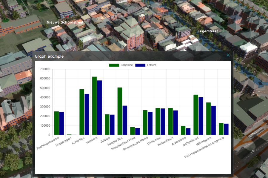
Opening the Excel, you will see how it functions internally. Datasets and a list of accompanying labels are constructed by concatenating values from each neighborhood row together into a single comma-separated string. The EXPLANATION of the excel starts with the default code, which places an html element to contain the chart and the functions to fill it. The metadata for a new chart is then created, defining whether it's a line-chart or bar-chart, and what labels to use for the data presented. Then, each dataset is added to that metadata. Finally, a function is called which will process all prepared data and create the chart in the initially added html element.
If you have your own indicator which has data you would like to display in a graph, you can opt to either copy over the default code from the example to your indicator, or to recreate your indicator in the example. From there, add a column to concatenate the data to a single string (as demonstrated in the example), and add the default code and function calls to the explanation. From there, experiment with adding more data, adding more charts, and possibly even modifying the default code to further fit your own needs!
This example makes use of version 2.9.4 of the Chart.js library, the documentation of which can be found here: https://www.chartjs.org/. It is retrieved from the jsdelivr CDN here: https://www.jsdelivr.com/package/npm/chart.js?path=dist&version=2.9.4.
Comments
@Steven NLGL @Maarten NL GL
Tygron Support Team